The first rule of landing page design best practices is this: No matter how much time you put into it, they are JUST a starting point. Every client base is unique and will do their own things. Be sure to experiment with A/B tests (we can help set those up!) to determine which color/headlines/layouts work best and let the customers decide what they think is the best converting page for the job.
But… there are best practices for landing page design that will give you a leg up over your competition and give you a good shot at getting a high converting landing page from the start
Jump to a Landing Page Best Practice
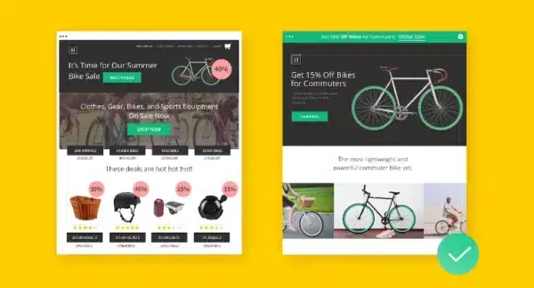
1. Ensure your messaging matches your ads. Show visitors what they expect!
You should be using landing pages to ensure you’re sending people to a page that matches their expectations. Help your visitors know they are in the right place by making sureyour landing page copy (and design) match the ads you’re running in search or social.
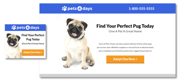
For example, an ad for fun t-shorts for kids that brings visitors to a landing page focused on whole family clothing will likely drive more visitors away than one that stays on message. In this example, the person click on the ad for kids t-shirts is expecting to see kids t-shirts for sale. Show them what they expect!!!
2. Keep the action above the fold
The term “above the fold” is an older term that refers to the upper half of the front page of a newspaper. Above the fold was the first thing people saw when looking at a newspaper. These days, it more often describes what’s visible on a screen before scrolling down. This is the most valuable place on your landing page and you’ll want to make the most of it.
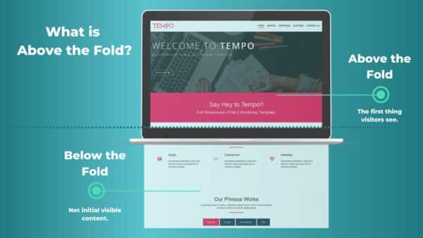
Keep your headline, unique sales proposition (USP), and, most importantly, your calls to action (CTA’s) highly visible by placing these elements above the fold. Don’t cram more than you need to onto the screen (less is more)-too much above the fold can make it difficult to see your CTA-but make sure everything a visitor needs is visible from the get-go.
3. Use directional cues to direct the eye
Include visual indicators that draw the eye towards what you want the visitor to do is a good idea. These cues can include literal pointers, like arrows, as well as other shapes, images, animations, or even copy that keep visitors happily scrolling and reading. Another great example is the hero image (first image on a page) that is “looking” in the direction of the main CTA button.
Similar directional cues should be used to help prospects find your call to action. Use bold, contrasting colors and an easily recognizable shape-buttons should look like buttons-so that the CTA pops out from the rest. Use arrows, animations, or even picture of pointing people to draw further attention to it.
It may sound cheesy, but these visual clues can make the difference between an OK landing page and one that is amazing at conversions!
4. Show your product/service in action
Showing your product or service in a real-life context helps visitors imagine themselves as your customer. Apple does this better than anyone. Every Apple commercial helps you to imagine “What if that was mine!” The old iPod commercials were fantastic at this. Just a silhouette dancing with their entire music library in the palm of their hands. You could just imagine yourself as one of those people dancing listening to your music library.
Showing your product or service is also an effective way to show how your product or service works. Whether you use still photographs, step-by-step animations, or demo videos, visuals can help you to capture and keep their attention.
5. Remove navigation and other distractions
A great landing page focuses on a single conversion goal, so minimize other distractions that might carry visitors away. So hide your header and navigation on a landing page. Resist the urge to include unnecessary links away from your landing page, including site navigation, additional calls to action, or even links back to your homepage. Your landing page will work best if it stands alone.

- Image from Unbounce
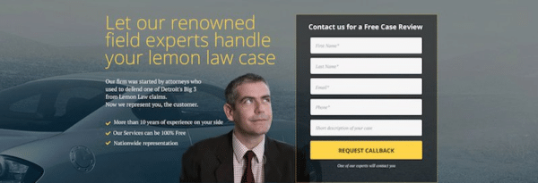
6. Include Social Proof (real testimonials)
People are savvy and getting savvier all the time. No matter how good you think your offering is, including reviews and testimonials of satisfied customers and community members can adds authenticity to your claims . It provides the proof in the pudding!
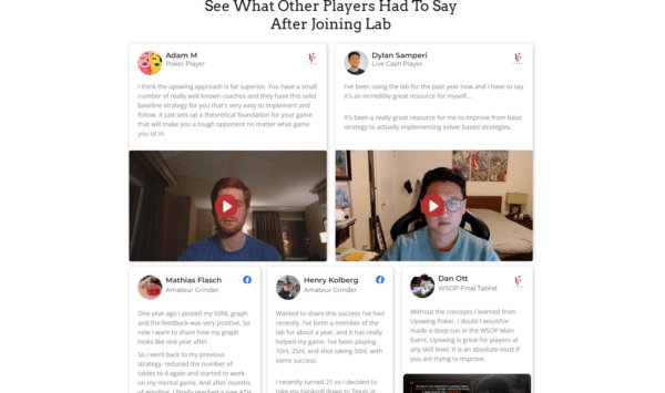
What is more convincing… perfect and glowing reviews from Jane Doe, Anonymous, and Satisfied Customer? Or real testimonials from real people? If you can (and if you have their permission to) include personal details, like first name and last initial, job titles, place of residence, date of purchase, biographical details, portraits, or even video.
7. Use clear and compelling copy
Good copy shouldn’t read like a novel. It should be clear and straightforward. It should be as readable as the back of a cereal box. If you can make it entertaining and engaging, even better! Though some offerings demand longer copy (and, as a result, longer landing pages), most benefit from keeping things short. Think fewer paragraphs, more bulleted lists.
Keep it simple and to the point.
TIP: Ask people unfamiliar with your business to read your headline and supporting copy. Then ask them what you’re offering and what problem you solve. If they can’t answer clearly, it’s time to revisit your messaging.
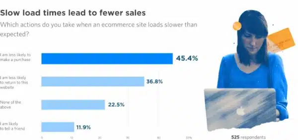
8. Keep it fast.
According to Unbounce’s Page Speed Report for Marketers, 70% of consumers admit that loading time influences their desire to buy. If your pages are taking more than 3 seconds to load on a mobile device, you’re going to lose a lot of potential customers.

- Image from Unbounce
Avoid weighing down your landing page with unnecessary elements that’ll slow it down-everything you add should have a specific purpose. Make sure all images are optimized and that you’ve followed Google’s speed recommendations.
Still not fast enough? We can help! Contact us and we will help speed optimize your website.
9. Design for the right device
Many campaigns (especially Business-to-Consumer) see a significant number of people browsing on their smartphones. (You might even be targeting people on the go.) This means that screens will be smaller, interactivity will be more limited, and load times will be slower.
None of these qualities are good for your mobile conversion rates, so ensure better performance by designing a mobile-responsive landing page that adapts to these devices. Layouts can be shifted, CTAs made more visible, and images can be shrunk or removed entirely. A good rule of thumb for mobile design landing pages is if an element doesn’t help with the sale, get rid of it. Less is more.
And if you are designing for a Business-to-Business landing page, then most viewers will be on a desktop (or laptop) at work looking for your services. In that case you can get away with slower load times and more elements on the screen. But remember… less is more. Don’t include anything in your landing page that doesn’t help drive the sale!
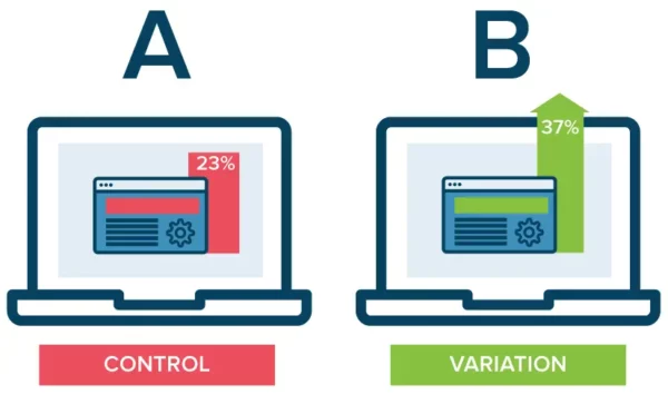
10. Do A/B Split tests! Test and update your landing pages
Best practices are important, but A/B testing your landing pages AFTER you have launched is the best way to ensure that you’re converting as much as possible.
- Have a hunch that your problem-focused headline isn’t working?
- Want to ask questions in a different order on your form?
- Is your boss insisting your CTA button should be fluorescent pink?
Test between different variations of your landing page, and make data driven decisions based instead of gut instinct. Don’t know how to run split tests? We can help with that!
11. Look at what your industry leaders are doing… and do that!
Everybody wants to be special. But if you’re just starting out (or just have limited developer resources), you can achieve impressive results by just copying what your competition is doing. Seriously… why start from scratch?
Do some research into your competition or other leaders in your industry and look at their landing pages and use a similar layout/design and copy (but use your own copy and images) as a starting point. Chances are very good that the best in your industry have already worked with their own design team and performed split testing on their landing pages already. By starting with something similar you can leverage what they are doing.
“Good designers copy, great designers steal .” – Pablo Picasso
Use what your competition is doing a strong starting point, and then go from there.
Bonus Landing Page Design Tips & Tricks
1. Reduce friction with multi-step forms
Nobody likes filling out paperwork or long forms. So when you need to ask lots of questions, it’s best to do it in multiple steps. Instead of presenting 15 fields to complete on a single page, break them up with multiple steps (step 1, step 2, etc). And start with the easier questions (“What’s your name?”) before getting to the more detailed ones.
2. Avoid manual entry
Use drop downs, bullet lists, checklists, etc. Choosing one option from a list of five is less taxing than manually typing out answers -and, as a result, it’ll lead to more conversions.
3. Include a privacy policy link in the footer
Lead-gen forms gather personal information. Including a link to your privacy policy will reassure your visitors that their data is safe with you. Its inclusion is also mandated by a number of national like the CCPA and international laws like GDPR. Don’t have a team of lawyers on retainer? There are tons of free privacy policies you can download online. (For instance, this generator made by Shopify.)
4. Use a separate “Thank You” page
When a visitor to your site completes a form or places and order, bringing them to a separate thank you page provides a good user experience (UX) and gives you an opportunity to present new offers.
For instance, you can ask if they want to sign up for your newsletter or visit another part of your website. Or you could start upselling a trial customer to a premium subscription right away. Or you could sweeten the pot with an additional offer. There are tons of post-conversion possibilities.