EDITOR’S NOTE: Copy is the wording on a page that convinces readers to take action. When it comes to your website copy, here’s the hard truth: no one will read what you write if it looks terrible on the page. This is why web design and website copy need to go hand in hand. When designing a website, keep these copy tips in mind. Don’t mess with colors and typography. The simpler the better. Avoid long text anywhere possible. Headings, descriptions, paragraphs, etc. Keep it short and digestible. Keep reading for more tips and examples! If you have any questions about website copy or design or want us to do it for you, reach out to us at Prebuilt Sites or The BBS Agency. We’d love to help you out!
As a UX writer, it’s my job to know how to create web copy that convinces readers to take action. That said, it doesn’t matter how engaging of a story I craft for my clients’ web pages or blog posts. If what I’ve written looks terrible on the page, no one will bother to read it.
Here’s the problem though: UX writers are not designers. No matter how many short sentences we write to succinctly communicate a point or jargon-free copy we craft to appeal to a broader audience, poor design choices will negate all of that.
Web designers are the ones that best know how to design for engagement and conversion. As such, you need to be comfortable working with copy as well as you do the visual piece.
1. Don’t Mess with Color
There are a lot of really cool ways to use color and create a memorable look for a website. But typography? That is not the place to mess around with color.
Let me show you something:
This is the website for the Red Lantern restaurant in Boston:
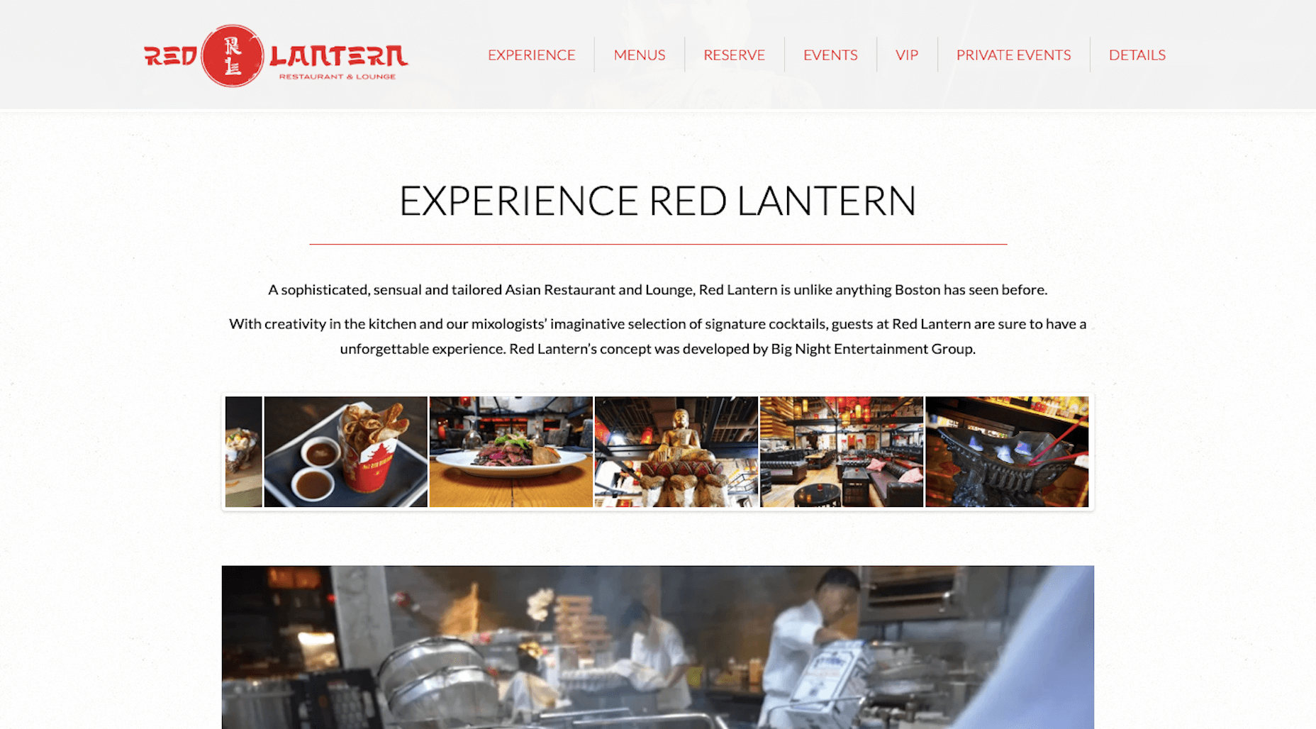
This website makes great use of wide open spaces to draw attention to the copy on the page. And, while the logo is in a decorative red font, the copy that really matters is black-on-white. Overall, this is a beautifully structured web page and also one that’s easy to read.
Now, let’s look at the Intercontinental Hotel:
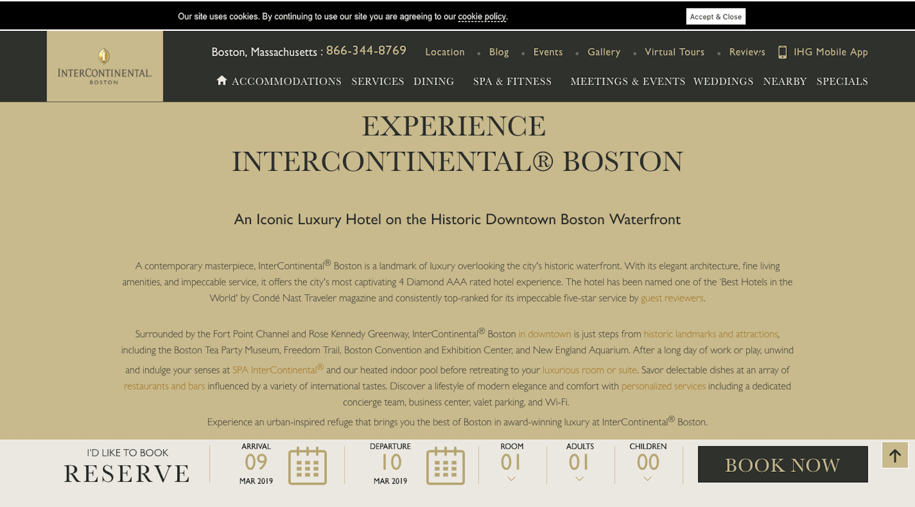
There are so many bad choices made with the font on this page.
For starters, it’s far too thin of a font at that size. In addition, the black font on top of the ecru background doesn’t work well either (again, that’s probably due to the skimpiness of the font face). And the hyperlink color against the similarly-colored background is an even worse choice.
I get that the designer wanted to incorporate the brand color into the page, but the background is overkill. A white background, black font, and branded hyperlink color would suffice.
2. Maintain Symmetry
In many cases, there isn’t really a need for symmetry in copywriting. Paragraphs and pages will run as long as they need to be, within reason. However, there is a particular part of a website where symmetry matters a great deal and it’s, unfortunately, something not a lot of writers are mindful of. Worse, there are designers who are too scared to do anything about it.
Here’s what I mean:
This is a block of side-by-side featurettes on the WordStream website:
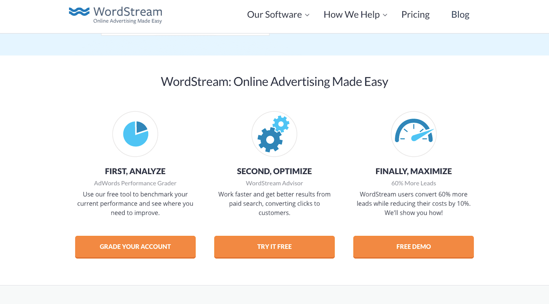
You’re familiar with this, right? You have a number of features, services, or benefits you want to include on a web page. However, you’d rather not list them out as vertically-aligned plain text. That’s boring and takes up too much space. So, you think, I’ll turn this into a multi-column element with graphics woven in.
In the case of WordStream, you would’ve succeed. Everything is balanced:
- Illustrations
- Header text
- Subheaders
- Explainer text
- CTAs
Now, have a look at Pixability:
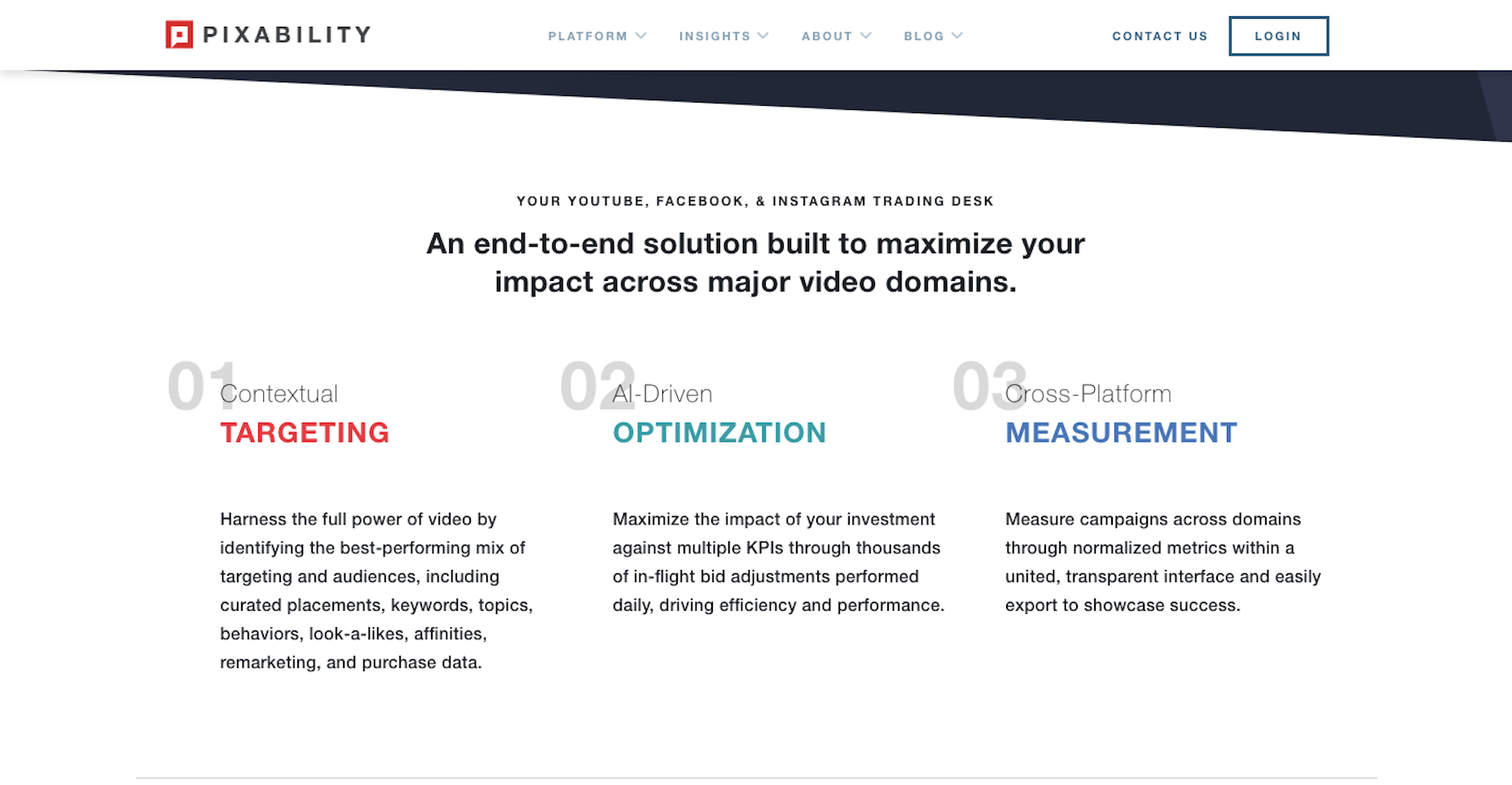
It follows the same basic concept. However, the first point runs on way too long. This not only creates a distraction, but it also leads to a lot of unsightly white space.
3. Break up Paragraphs
In general, you never want a paragraph to run longer than five lines on a web page. Anything longer, and it’s safe to say your readers will lose focus. The same happens when you place too many paragraphs one after another.
Your readers need a break.
While the writers should be the ones to determine where a pause should fall within the text, there are other things you can do to break up the monotony of paragraph after paragraph.
Take, for example, what Consigli Construction does to tell its business’s story:
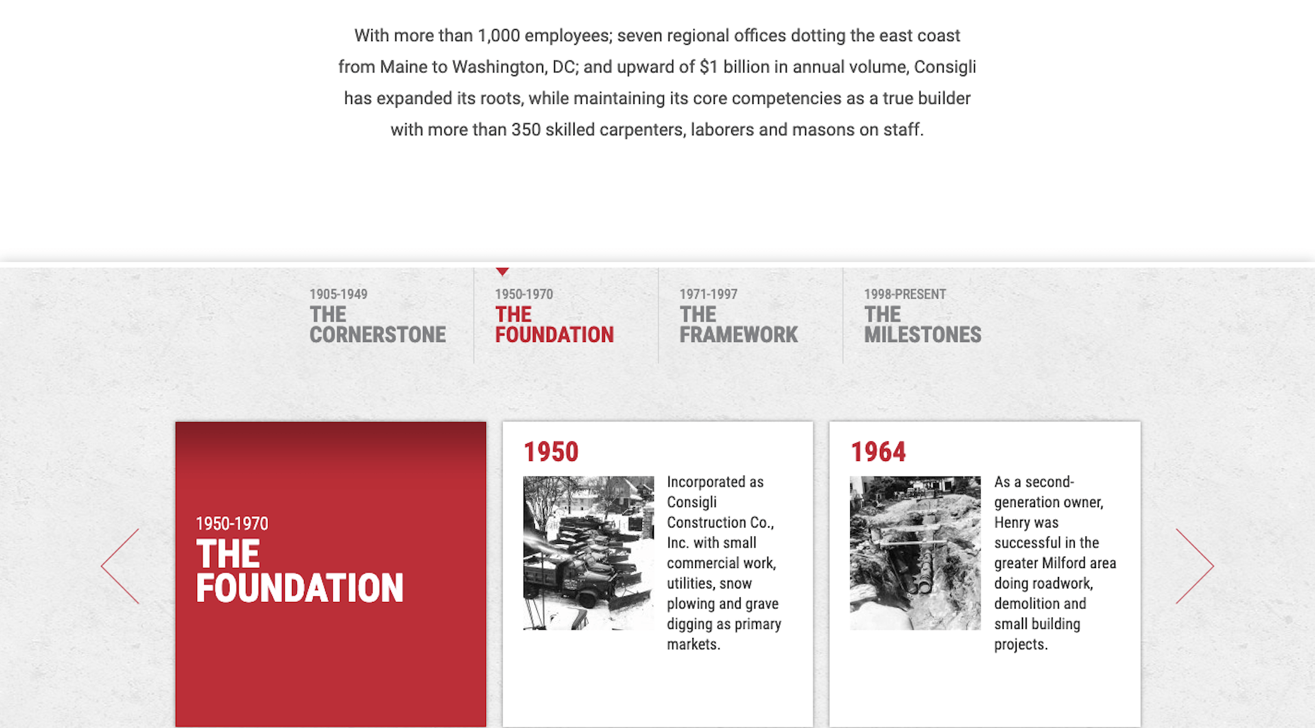
There are never more than two paragraphs placed together, before they’re broken up by a creative element. In this case, the history of the company is divided into logical chunks and key milestones get their own dedicated boxes. This looks great.
Contrast that with the Bright Horizons website.

Usually, I’m all for bulletpoints as they help to break up thick chunks of text. In this case, though, they’re not very well done. For starters, each bulletpoint is too long. Also, the bold font is overwhelming.
To fix this, the designer could go a route similar to Consigli Construction and give each bullet its own dedicated block. Or the designer and writer could work together to strip out the excess. For example, the list could realistically be shortened to:
- An assigned primary caregiver;
- Personalized care plans;
- Sensory-rich spaces and soft places;
- Safety, security, and cleanliness practices.
4. Be Space-Conscious with Header Tags
Header tags are an essential part of every page on a website, from the home page to blog posts.
Structurally, they help create a hierarchy of topics, enhancing readers’ ability to scan a page and get an idea of what it’s about without having to read it. In addition, Google bots use header tags to pick up on the key points of a page and rank it according to how well it matches users’ search queries.
That said, you should be careful about how much space your headers take up. As a general rule of thumb, they should be no more than one line.
Take this example from Audley Travel:
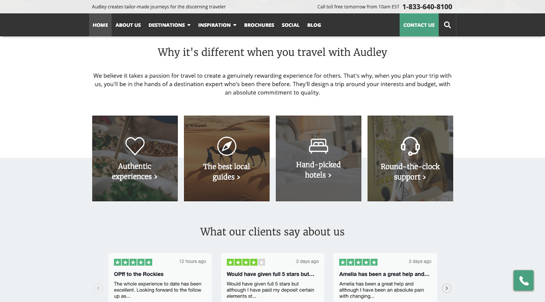
There are two header tags here and both are kept to a reasonable length while still accurately getting the point across.
Then, you have this example from Bevi’s blog:
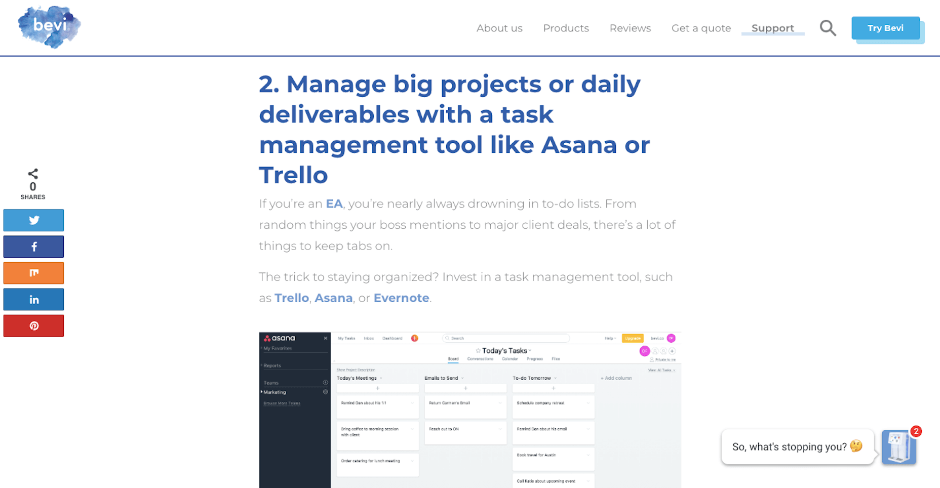
This is a clear example of where header tags become too much.
But it’s not just the size of the header text that’s the problem. It’s the length of the statement itself. Rather than give away what the ensuing text is going to tell the reader, this could simply be left as: “Manage projects and deliverables with a task management tool” or, even better, “Use a task management tool”.
What Web Designers Can Do to Improve Website Copy
While I’d love to say that it’s 100% the UX writer’s responsibility to write copy that converts, there are clear examples of how design can get in the way of that happening. All the more reason why a website should be a collaboration among all parties involved in it.
If you’re ever unsure of how your design choices will affect the quality of the copy, seek out the UX writer’s opinion. Or your project manager’s. Their fresh eyes might be able to catch something that you cannot.