The better your visuals are on Instagram, the better your Instagram engagement will be. And while reach and likes are important, your engagement is more valuable to your business as it shows how much your audience cares about what you’re saying and/or selling. In your brand as a whole, it’s important to keep your branding consistent. Pick a color scheme and stick with it. Pay attention to what you want your audience to focus on in an image (such as a singular object or person) and minimize the background noise. Keep the design simple overall and colors pleasing to the eye. When creating your visuals, think about what conversation you’re looking to start that day, and keep your focus there. If you have any questions about your social media amrketing strategy or want us to handle it for you, reach out to us at Prebuilt Sites or The BBS Agency. We’d love to help you out!
Do you want more likes on Instagram? Looking for new ideas to improve your engagement?
In this article, you’ll learn about a new data-backed approach for creating visuals that drive better Instagram engagement.
What Makes an Instagram Image Visually Appealing?
For experienced social media marketers, the visual appeal of an image can seem secondary to all of the algorithmic aspects that impact Instagram post performance. It’s tempting to think that a stunning image isn’t enough to drive engagement. After all, countless factors affect like counts from the size of the audience and the timing of the post to the nature of the content and the call to action (CTA) In the caption.
Yet a recent study published in the International Journal of Research in Marketing suggests that even after accounting for all of these factors, images with a certain set of characteristics reliably get more likes. In fact, images with the right combination of qualities get an average of 3% more likes and 19% more engagement.
After all, people can process visual data like an Instagram image in 100 milliseconds—much faster than they can read a brand name, understand a caption, or click to see the post’s tags. Essentially, compelling images can stand out in an endless stream of content, inspiring Instagram users to stop scrolling and start engaging.
For most brands, the benefits of producing better images don’t stop with likes. As the study explains, creating more likable images can help grow your audience, influence purchase intent, and affect customer spending. That’s because visually appealing images are critical for making good first impressions so you can draw people in and then prompt them to act.
Source: Social Media Examiner
To create a framework for evaluation, the study explores what makes an image visually complex and how these characteristics correspond to likes. The researchers focused on two main components of visual complexity, each of which has three defining qualities.
Evaluating Visual Complexity
To conduct the study, the researchers started by using the Gartner Digital IQ Index to identify 1,000 top brands. They then collected all of the Instagram posts these brands published during a 1-year period from 2015-2016. After eliminating brands that posted less than once per week during this timeframe, the researchers compiled about 150,000 posts from more than 600 brands in more than two-dozen industries.
Then the researchers evaluated the six factors of visual complexity by developing a program that could automatically process the 150,000 images and generate a score for each factor. The researchers also tallied the number of likes for each image.
After processing the 150,000 images, the team validated the results with the help of research groups. Altogether, about 300 participants compared about 900 image pairs based on one of the six visual complexity factors. Overall, the feedback from the research group closely aligned with the computer-generated results.
Ultimately, the study finds that the relationship between visual complexity and Instagram likes isn’t linear. In other words, images don’t generate progressively more likes as both feature and design complexity increase. Instead, the optimal level of feature complexity is in the middle of the range, while the optimal design complexity is on either the high or the low end of the spectrum.
Feature Complexity
Feature complexity refers to the basic pixel-level properties of an image:
- Color richness and distribution throughout the image
- Luminance, or the balance of brightness levels throughout the image
- Edge density, or the number of edges within the image
In general, images with higher feature complexity—meaning more variation in color, luminance, and edge density—typically look more detailed. In some instances, that’s a good thing. A highly detailed image tends to be more memorable, which can lead to better brand or product recall.
Source: Social Media Examiner
But on Instagram, images with high feature complexity can be overly challenging to comprehend, especially as people quickly scroll through their feeds and attempt to process images instantly. That may mean people won’t take the time to try to understand an overly detailed image, let alone like it or otherwise engage.
That doesn’t mean less detail is necessarily the answer, however. The study also finds that images with lower feature complexity don’t perform well either. Images that aren’t detailed enough tend to have a lower ability to stop the scroll, which can lead to lower engagement.
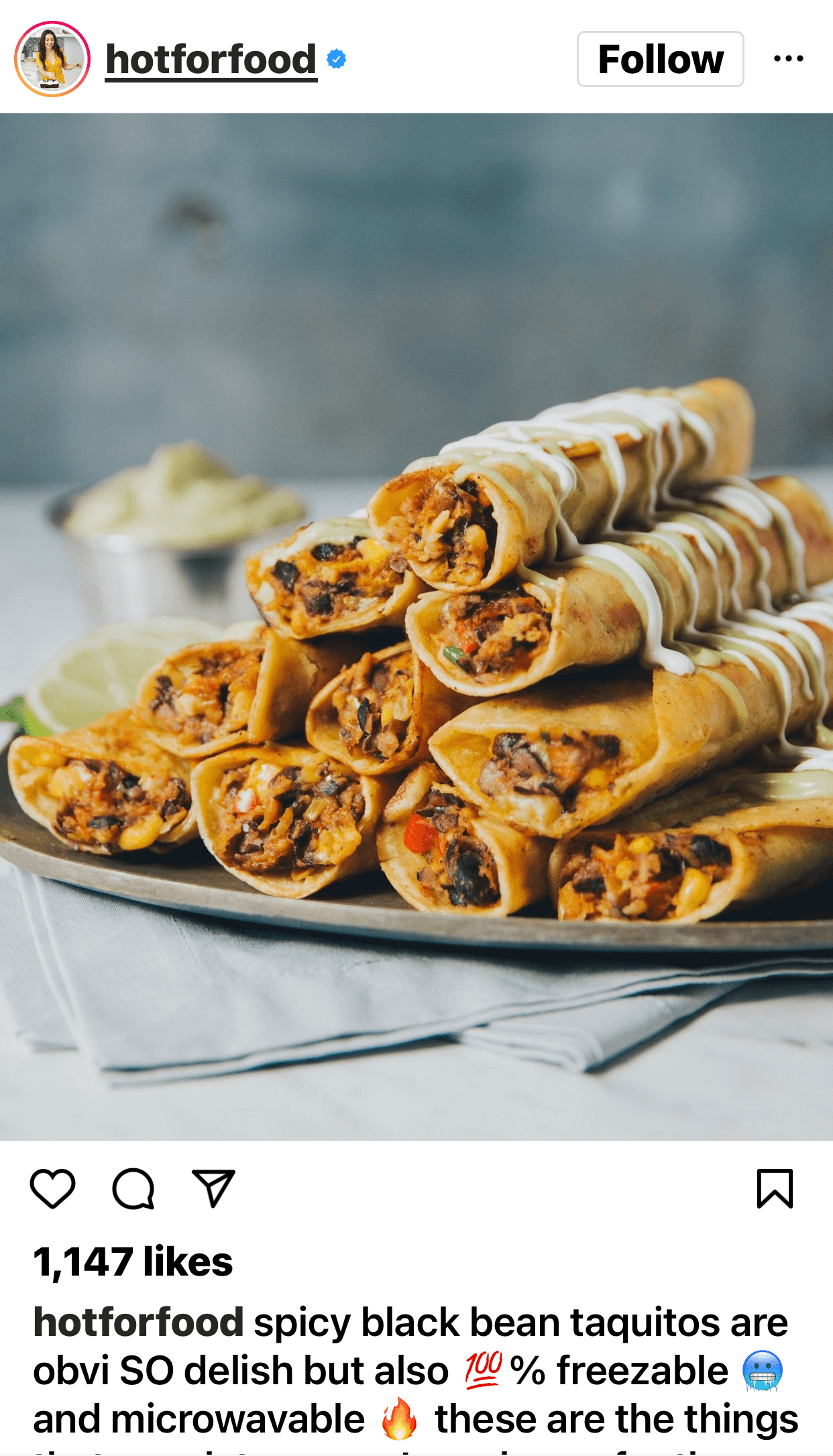
As a result, the study suggests that images with mid-range feature complexity tend to generate the most likes. For example, the @hotforfood Instagram photo above includes an optimal level of feature detail. The color, luminance, and edge density all land right in the middle, making it a highly likable image based on the study criteria.
How can you create an image with the right level of feature complexity for your business? See below for a breakdown of each factor and how you can adjust them with Instagram filters and third-party editing tools.
Design Complexity
Design complexity refers to the overall composition and the arrangement of elements within an image:
- Number of objects displayed throughout the image
- Regularity of the objects including their orientation and overlap
- Symmetry of the objects including both vertical and horizontal arrangements
While most people process feature complexity relatively easily, design complexity typically demands more brainpower. That’s because processing design complexity requires identifying objects and recognizing patterns.
In many cases, Instagram images with low design complexity can be highly engaging, as in the example below from @greats. They can capture people’s attention instantly and quickly make a good first impression. Because they’re easy to understand, they require a smaller cognitive load to process—which can be appealing.

Source: Social Media Examiner
But images with high design complexity also tend to perform well on Instagram, especially when they’re uncluttered and the patterns are easy to identify. Because these images are more detailed, they require more focus and mental energy, which can be rewarding.
As a result, the study suggests that images with either low or high (but not medium) design complexity tend to generate the most likes. How can you strike the right balance among various design elements? See below for a breakdown of the three factors and an explanation of how you can arrange your photos to incorporate each one.
6 Instagram Image Elements to Optimize for More Likes
From feature complexity to design complexity, high-performing Instagram images need the right mix of visual elements. Take a look at how to optimize each of the six factors so you can maximize likes on your Instagram posts.
#1: Color Spectrum
When it comes to color richness and distribution, the study concludes that images in the middle of the spectrum tend to perform best. As the results show, Instagram likes gradually decline as the number of colors in an image increases.
Does that mean black-and-white images are the solution? Not necessarily—the results reflect an inverted U shape, meaning that likes tend to be lower for images at both ends of the spectrum. The study found that black-and-white photos and images with isolated pops of color didn’t perform particularly well either.
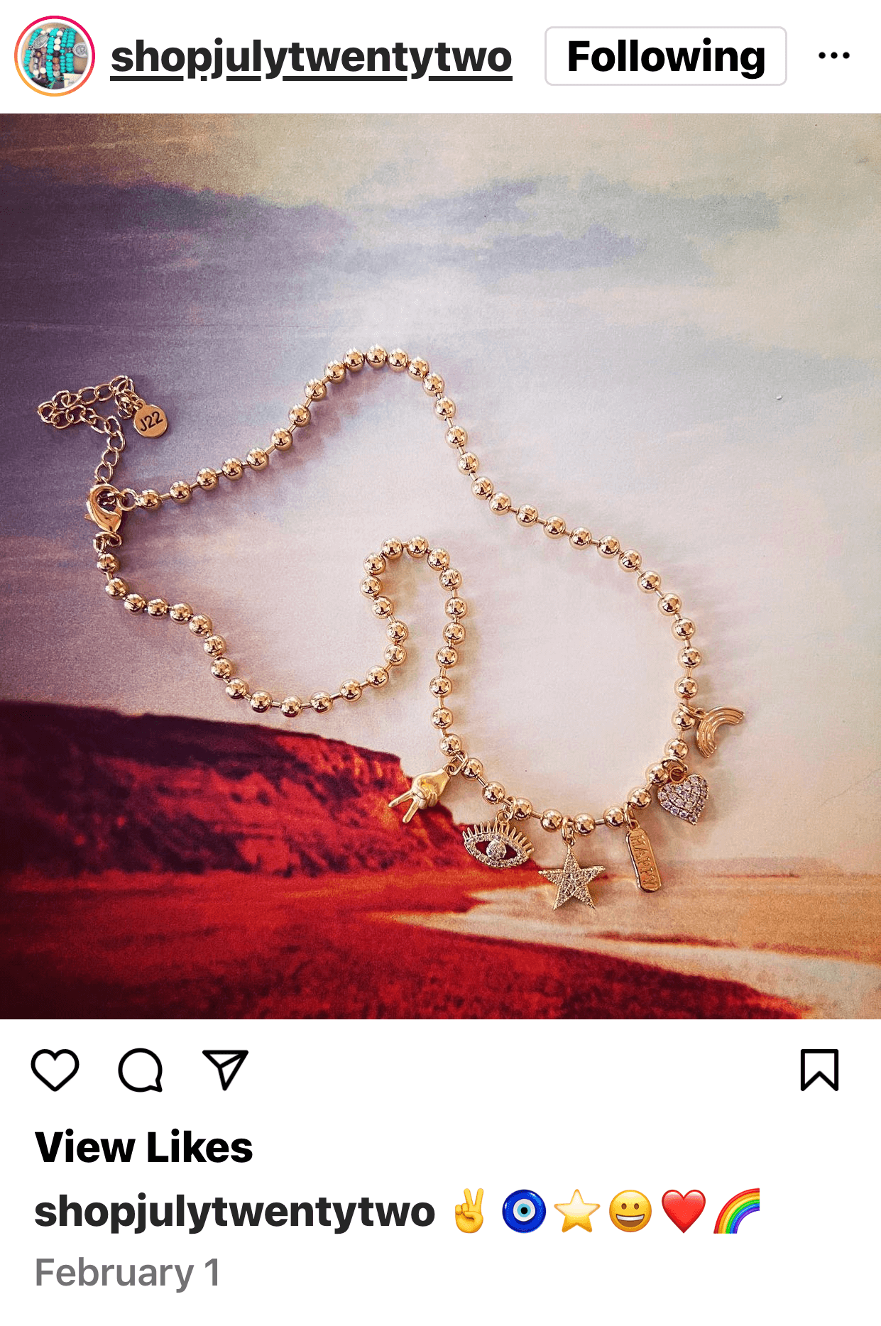
Instead, images with a few easily identifiable colors and a somewhat muted palette tend to be the most likable, as in this example from @shopjulytwentytwo.
Source: Social Media Examiner
Like all feature complexity factors in this study, color is an element you can adjust after taking a photo. Before posting an image to Instagram, consider dialing the saturation up or down slightly to reach the ideal level. You can also apply an Instagram filter that deepens the color or creates a more uniform tone.
#2: Luminance
How much luminance should your Instagram photos feature? The study suggests that luminance tends to be most appealing when it falls in the middle of the range. As luminance decreases, likes eventually decline.
That means flatter images with minimal highlights and shadows typically generate fewer likes. At the same time, images with imbalanced shadows and highlights also have below-average like counts.
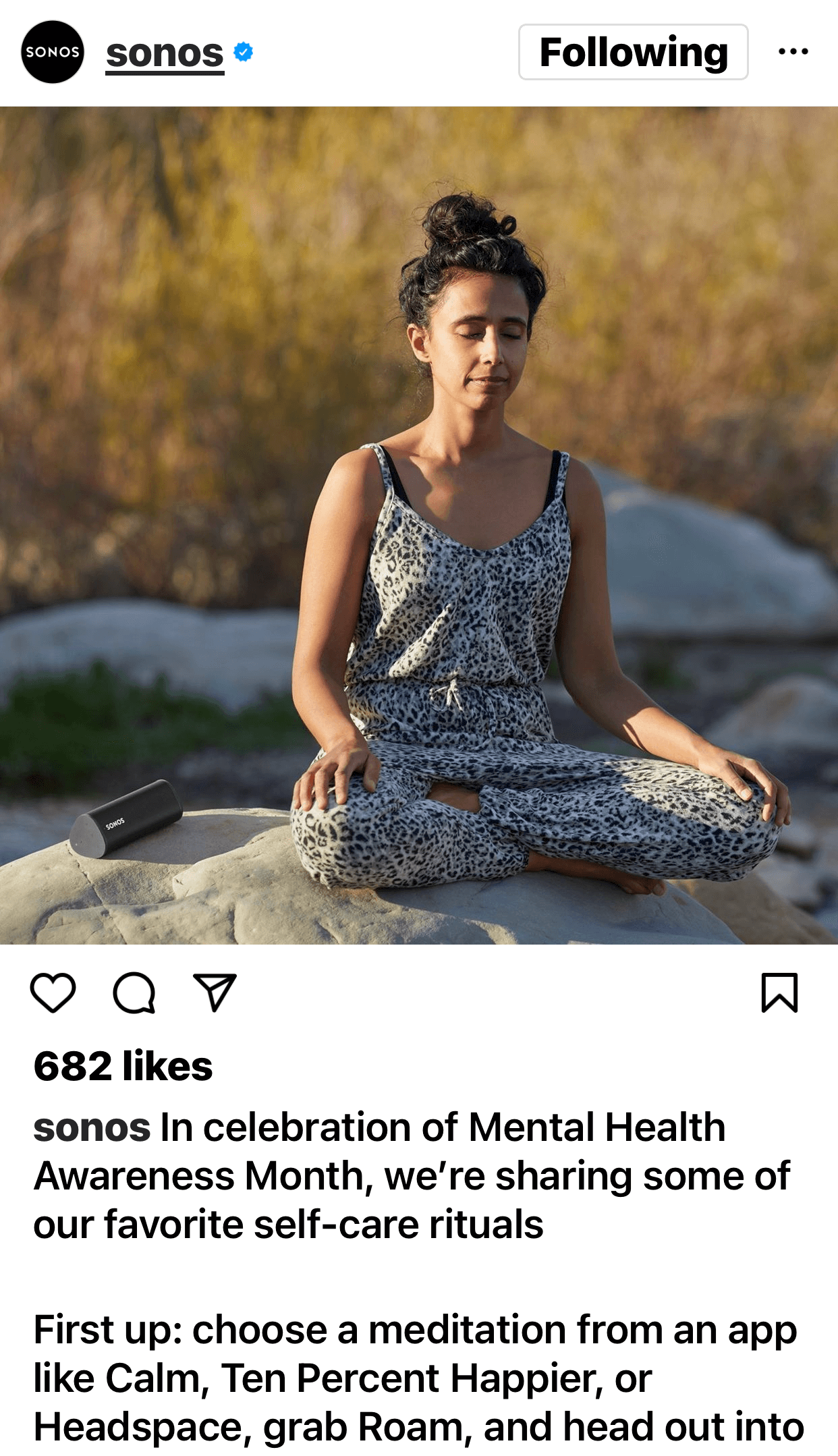
Instead, images with mid-range luminance levels perform best. For example, the @sonos Instagram photo below features the optimal luminance levels. The highlight levels in the image give the scene an appealing brightness, and the shadow levels add depth without making the photo appear overwhelmingly detailed.
Source: Social Media Examiner
Similar to color levels, you can adjust your Instagram photos for luminance during the editing process. If your image has minimal contrast or appears muddy, you can increase the shadows and highlights.
If your image already has dense shadows and overblown highlights, you can dial these elements back. Adjusting the brightness and contrast levels can also help with getting luminance just right.
#3: Edge Density
The number of edges in an image can correlate closely with the number of objects in an image. But measuring the edge density in an image isn’t always so simple. In a photo, the objects themselves can certainly have edges that define their boundaries but edges can also come from alternating shapes, colors, and textures.
Achieving the ideal edge density can be surprisingly important for Instagram images. As the study shows, people tend to be more forgiving when color or luminance is slightly outside of the ideal level. But when edge density increases or decreases from the optimal level, likes decline immediately.
In other words, it’s essential for Instagram images to have the right mix of edge and interior pixels. For example, the @goodiegirlcookies Instagram post below features at least a dozen cookie boxes, each with bold shapes and well-defined edges. But the many solid blocks of color balance out the edges, resulting in an image with the right amount of detail.

Source: Social Media Examiner
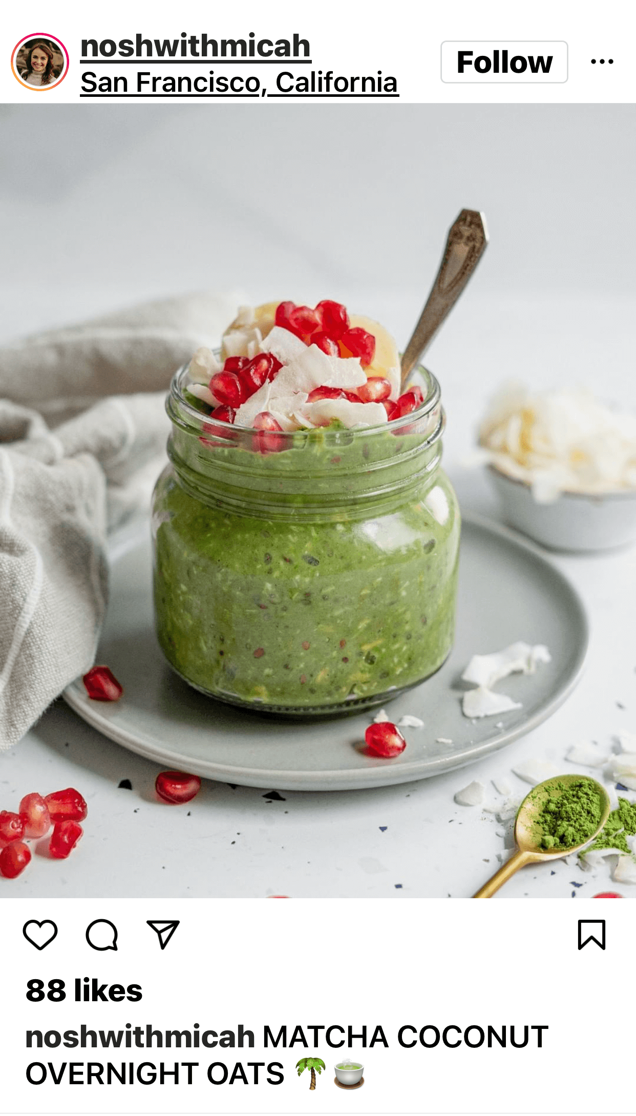
The @noshwithmicah Instagram post below strikes a similar balance using fewer objects. Although the objects don’t feature bold patterns, the materials and ingredients do have texture, which creates edges. These textures balance out the smoother background and foreground surfaces to create the ideal level of detail.
The first step to achieving optimal edge density is choosing a subject or a scene with a natural balance between edges and interiors. You can also adjust for the appearance of edge density by increasing or decreasing contrast or by changing sharpness levels before posting images to Instagram.
Source: Social Media Examiner
#4: Object Count
Unlike the three elements of feature complexity, the ideal level of design complexity tends to be either high or low, rather than right in the middle. For number of objects, the study results fall into a U-shaped pattern, with the highest number of likes at either end of the spectrum.
So if you’ve ever wondered how many points of interest to include in your Instagram images, there are two possible answers. It’s best to include many or just one or two but probably not a handful.
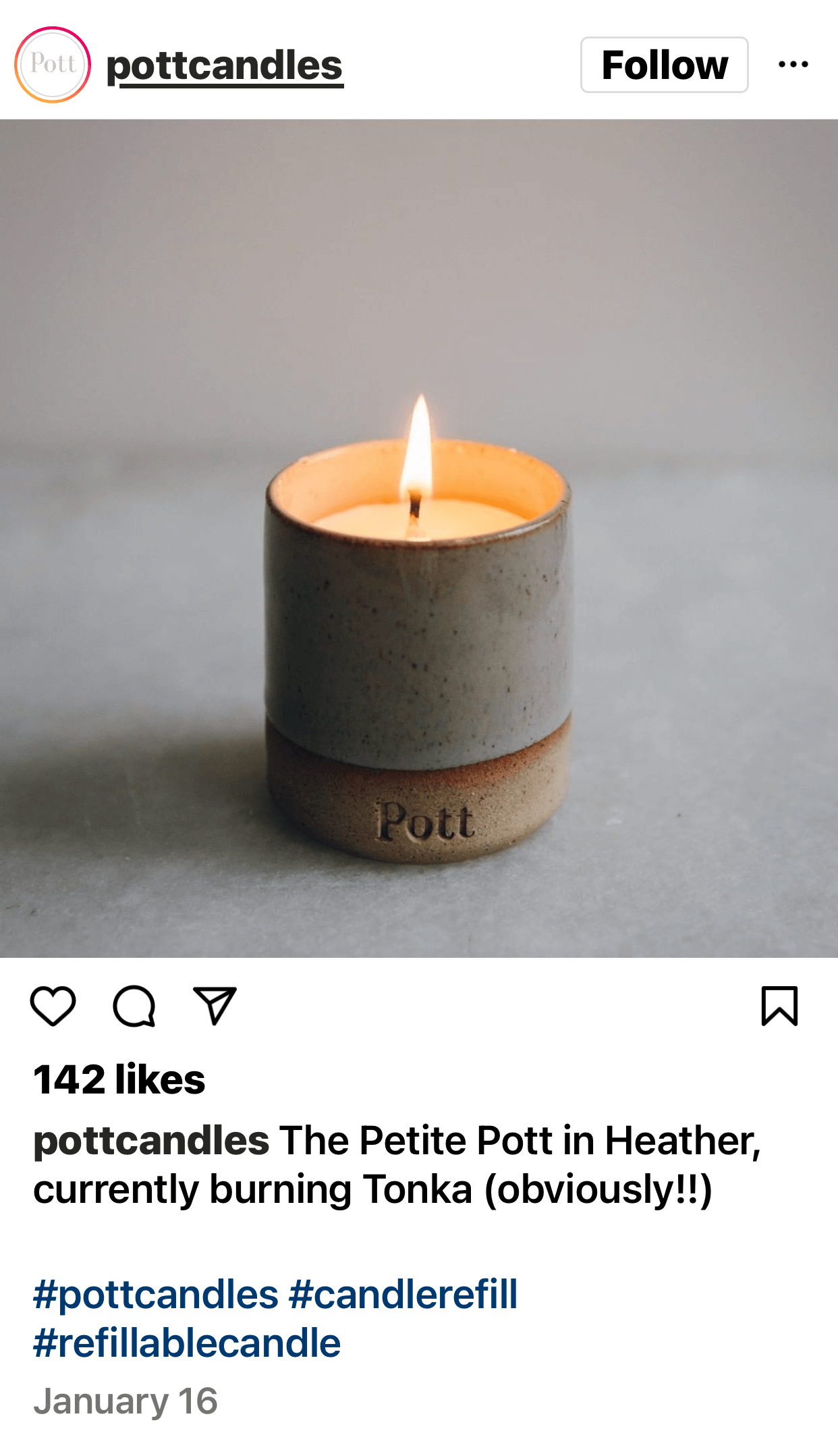
For example, the @pottcandles Instagram post below clearly falls at the low end of the range. The photo features a single object placed near the center of the frame. The lower design complexity makes the image straightforward to process and easy to like.
Source: Social Media Examiner
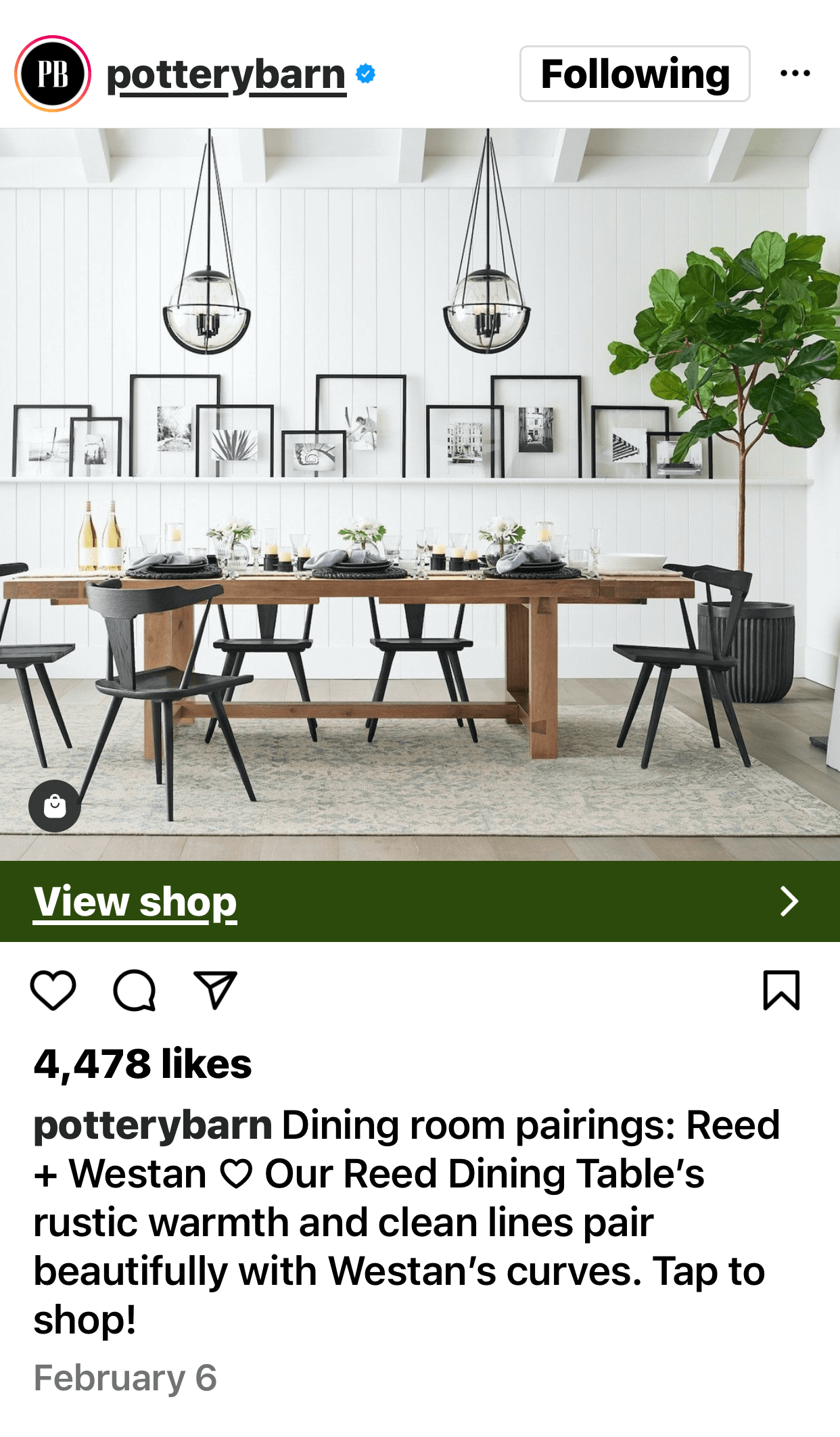
The @potterybarn Instagram post below falls at the opposite end of the object number range. From the furniture to the artwork to the table décor, this image includes well over two-dozen objects. It’s just as appealing and likable because it has a lot of information to process.
While you might be able to crop an image differently to change the number of objects in view, it’s easiest to address design complexity factors before taking a picture. Try composing your Instagram photos around a single subject or zooming out to capture a higher number of objects.
Source: Social Media Examiner
#5: Object Regularity
Similar to the findings related to object number, the study suggests that the optimal level of object regularity is either low or high. Instagram images with easily identifiable patterns tend to be highly likable, as are photos with more irregular arrangements.
Images with the least likable object arrangements tend to include a handful of different shapes placed at irregular angles or intervals. These images are most likely to appear cluttered or disorganized.
For example, the @breadsrsly Instagram post below has a high level of object regularity. The photo features many of the same types of objects placed in a clear pattern, making it easy to understand.
To create a photo with the right level of object regularity, focus on the patterns in the frame. You can organize objects into a cleaner arrangement or compose your photo to capture a highly irregular pattern.

Source: Social Media Examiner
#6: Symmetry
Unlike the two other design complexity elements, high and low levels of symmetry don’t appeal equally. Instead, the study shows that likes decline dramatically when images appear more asymmetrical. That means the more symmetrical your image is, the more likely it is to perform well on Instagram.
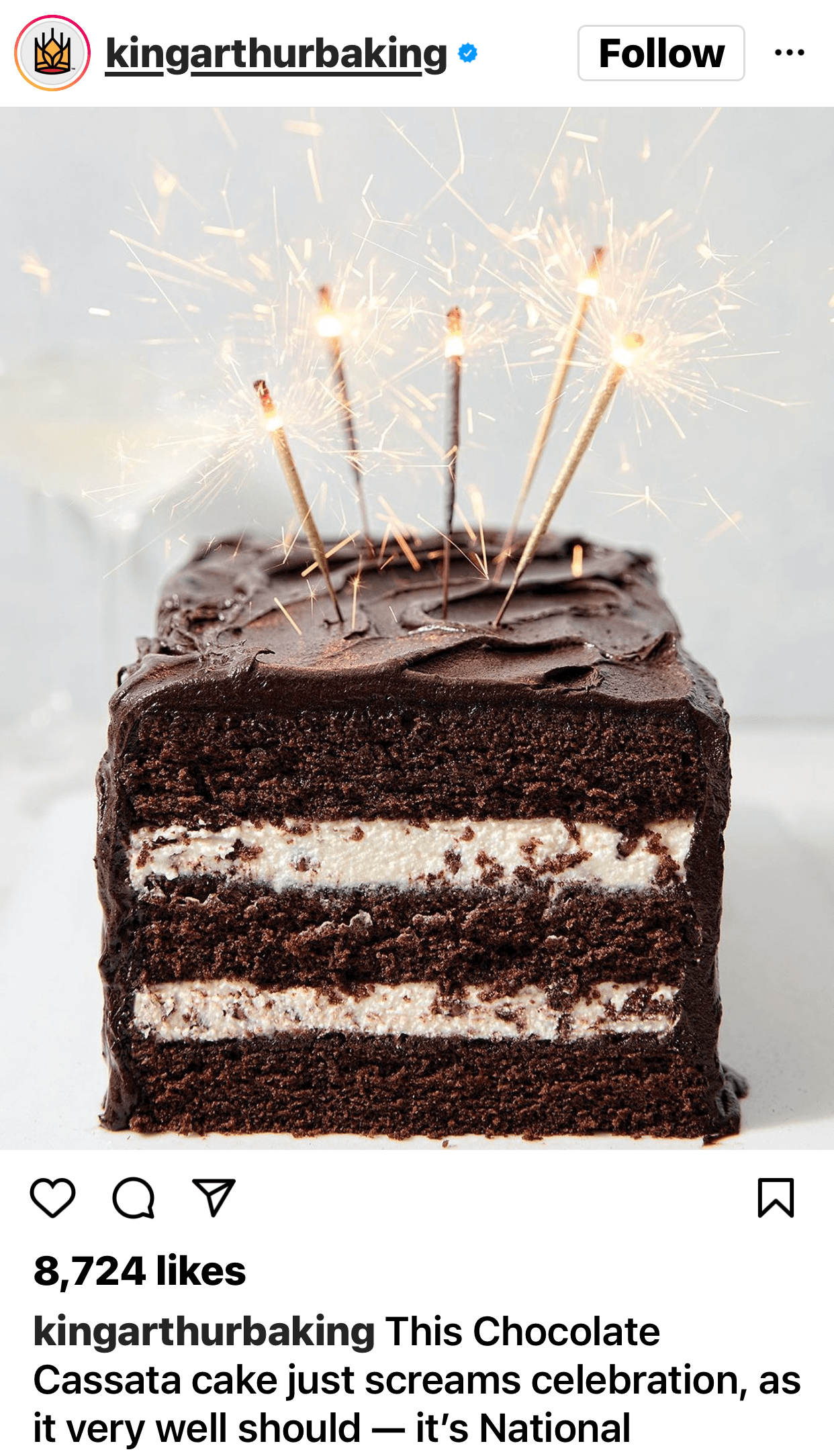
For example, the @kingarthurbaking Instagram post below features a symmetrical composition. The cake is positioned at the horizontal center of the frame, and the candles are arranged in a symmetrical pattern.
You can create symmetrical Instagram images by choosing compositions that have strong vertical or horizontal balance. If necessary, you can also increase symmetry by cropping out extra details or objects before posting images to Instagram.
Source: Social Media Examiner
Conclusion
As this study suggests, when your images include the right level of visual complexity, they can generate more likes and engagement on Instagram and may even influence purchase intent or other high-value outcomes. You can use the recommended feature and design elements to improve your creative workflow and publish more likable Instagram images.
But it’s important to remember that this study reflects the optimal criteria for feed photos only. To generate more engagement for Stories and Reels, you may need to do some experimenting so you can determine the right mix of factors for reaching your company’s social media marketing goals.
Get More Advice on Instagram Marketing
- Create an organic Instagram marketing strategy from scratch.
- Improve your Instagram marketing in eight easy steps.
- Save time managing your Instagram ads.
Originally published on Social Media Examiner.